Evolving parent app theming for a better experience
I designed the parent app theming experience end to end, giving schools control over their branding while ensuring a consistent and accessible experience for parents.
The gist of it:
The problem
Schools had limited control over their branding in the parent app, leading to an inconsistent experience that reduced recognition and trust for parents.
The solution
I designed a structured theming system that allowed schools to apply their branding while ensuring a consistent and accessible experience for parents.
Why it mattered
This improved trust and recognition for parents, gave schools a scalable and accessible way to reflect their identity, and reduced support requests by clarifying that communication and branding came from schools rather than ParentPay.
My role in this project:
I designed the School Gateway parent app theming experience end to end, working closely with schools, internal stakeholders, and developers to balance flexibility with consistency. The goal was to allow schools to apply their branding without compromising usability or accessibility for parents.
As part of a later platform-wide update, the theming setup was aligned with the new ParentPay Design System and WCAG AA standards, with a focus on improving clarity and maintainability across school-facing workflows. The final designs were fully implemented and prepared for release.
The full story:
The challenge
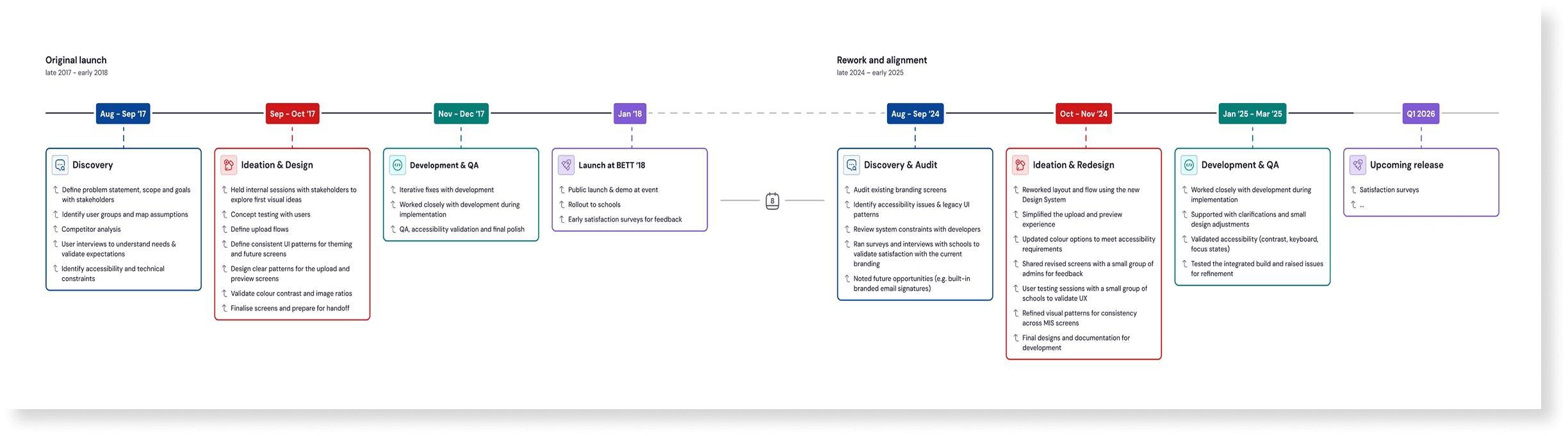
The parent app theming work evolved across two distinct phases, driven by different needs at different points in the product’s lifecycle.
Phase 1: recognition & trust
Schools needed a clear way to express their identity within the parent app so parents could easily recognise when communications were coming from their child’s school rather than from Schoolcomms. My challenge was to design a theming approach that allowed schools to apply their branding confidently, while preserving clarity, usability, and a familiar experience for parents.
Phase 2: alignment & maintainability
As part of wider platform consolidation, the existing theming setup needed to be modernised to align with the new design system and unify the experience across the product suite. This phase was primarily driven by business and technical requirements, with a focus on improving consistency, maintainability, and accessibility across school-facing and parent-facing surfaces, without disrupting established workflows.
Across both phases, the challenge was to evolve the theming experience carefully, balancing flexibility for schools with consistency for parents, and making incremental improvements without over-engineering or unnecessary change.
Below:
Timeline overview showing the original delivery and later system-led evolution of the feature.
Below:
Timeline overview showing the original delivery and later system-led evolution of the feature.
Phase 1:
2017: Designing the theming feature from scratch
Problem statement
Schools had no way to visually distinguish their communications within the parent app. As a result, parents often struggled to recognise whether messages were coming from the school or from School Gateway itself, weakening trust and clarity in school-to-parent communication.
Research, alignment, & ideation
To understand how school branding should work in practice, I worked closely with schools and internal teams to gather requirements and constraints. This included interviews with schools to understand their perspective, internal workshops with stakeholders to align on technical and business considerations, and a collaborative ideation session with teams such as Sales, Support and Product to define how school identity should appear in the app.
User flow & information architecture
Alongside this, I audited the existing Schoolcomms setup to determine where branding configuration would best live within the system, then defined the user flows and information architecture to support a clear setup-to-app experience. Early sketches and low-fidelity wireframes were used to explore options and discuss feasibility with developers.
Below:
High-level information architecture showing where branding configuration lives within Schoolcomms.
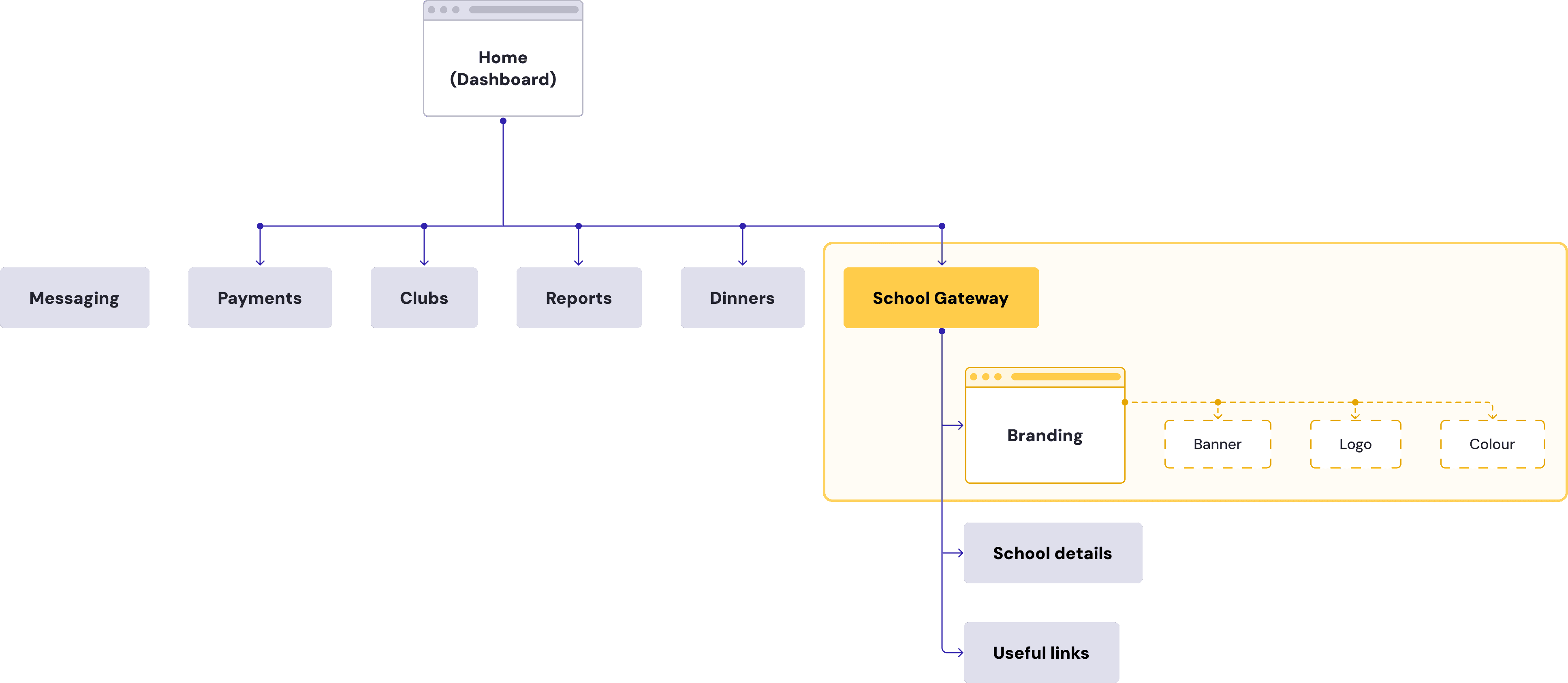
Design constraints
This work was intentionally scoped to a limited surface. Existing pages and navigation could not be restructured, and the solution needed to be delivered quickly within established system patterns. The School Gateway area already existed within the dashboard alongside School details and Useful links, making it the most logical and least disruptive place to introduce branding configuration.
Below:
High-level user flow showing how schools configure and preview branding before publishing to the parent app.

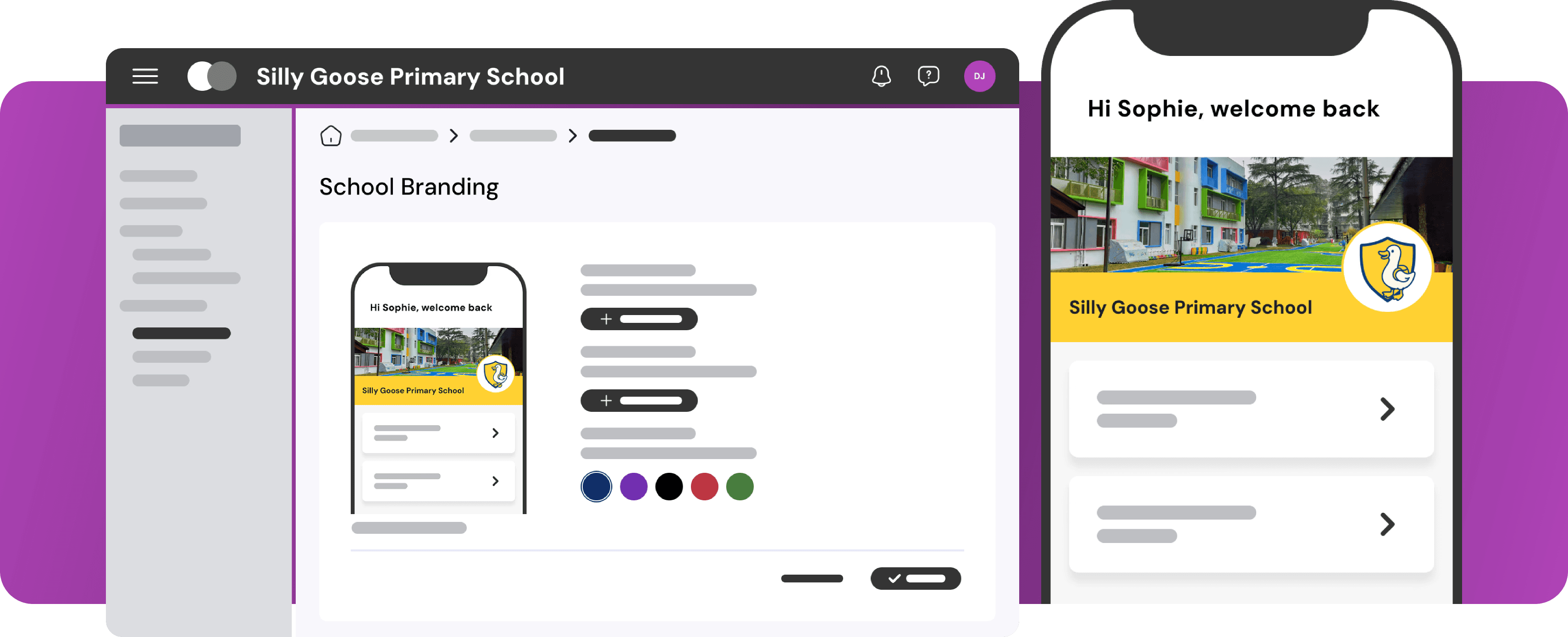
The branding setup provides an in-context preview of the School Gateway parent app as schools upload a banner, logo, and select a colour. Changes are reflected immediately in the preview, making it clear how the branding will appear before it is published.
Once published, the selected branding is applied to the parent app automatically. Parents see the updated school identity the next time they open the app, without requiring any additional configuration, app update or follow-up from the school.
Key considerations in the flow:
Image uploads use the device’s default file picker, reducing friction and cognitive load.
File type and size validation happens immediately, with clear error messaging when needed.
Branding changes remain reversible until publication, encouraging exploration rather than caution.
The setup experience mirrors the simplicity of the outcome: minimal inputs, visible impact.
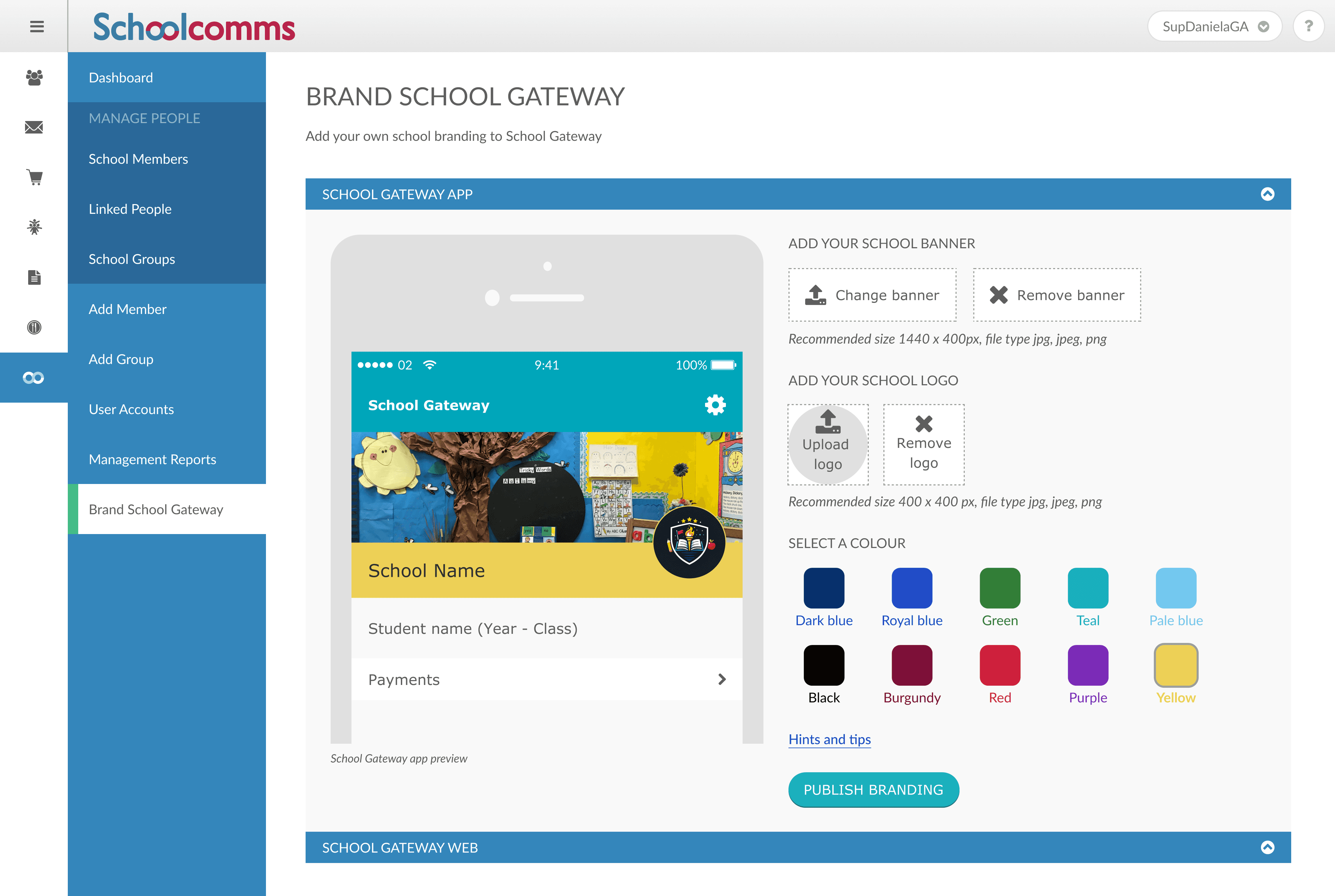
Design & delivery
I progressed the work into high-fidelity screens and collaborated closely with developers throughout implementation to ensure the experience matched the intended behaviour and accessibility requirements. All designs followed the existing design system and established UI patterns, working within its constraints rather than redefining visual language.
The feature was presented at BETT ’17, where it was well received by schools, and was released to customers shortly after.
Final-design.png
The goal of the final design was to give schools a simple and consistent way to apply their identity within the parent app, while ensuring the experience remained clear and recognisable for parents. To achieve this, the solution focused on a small set of deliberate design decisions.
Limited branding to banner, logo, and colour
Branding was intentionally limited to a banner, logo, and colour. This struck a balance between giving schools a clear visual identity and maintaining a clean, accessible experience for parents, avoiding unnecessary complexity or visual noise.
Introduced an in-context live preview
A real-time preview was used to show how branding would appear in the parent app before publication. This reduced uncertainty, minimised errors, and allowed schools to make confident changes without risk.
Designed for recognition and trust, not decoration
Branding was applied consistently and sparingly to anchor communications to the school’s identity. The goal was immediate recognition rather than visual customisation, reinforcing credibility without distracting from content or core functionality.
Below:
2017 final school-facing and parent-facing theming screens
Phase 2:
2025: Evolving the feature within the ParentPay ecosystem
Background
This phase wasn’t driven by user dissatisfaction, but by business and system integration needs. Following Schoolcomms acquisition by ParentPay, all modules needed to adopt the new Design System to ensure visual and functional consistency across the MIS (Management Information Systems) ecosystem. This created an opportunity to modernise the theming setup, address accessibility gaps, and validate the feature’s continued value for schools and parents.
What was done and changed:
Conducted lightweight validation with schools to confirm continued satisfaction
Rebuilt the school-facing upload flow using the ParentPay Design System
Retained the proven parent app branding model, refreshing visuals without functional changes
Brought the feature up to WCAG 2.2 compliance
Below:
2017 final school-facing and parent-facing theming screens

Final-final-design.png
The goal of the Phase 2 redesign was to modernise the branding experience within the ParentPay ecosystem while preserving the familiarity and effectiveness of the original model. The work focused on improving structure, accessibility, and visual consistency across both the school-facing setup and the parent app, without introducing unnecessary behavioural change.
Limited branding to banner, logo, and colour
Branding was intentionally limited to a banner, logo, and colour. This struck a balance between giving schools a clear visual identity and maintaining a clean, accessible experience for parents, avoiding unnecessary complexity or visual noise.
Introduced an in-context live preview
A real-time preview was used to show how branding would appear in the parent app before publication. This reduced uncertainty, minimised errors, and allowed schools to make confident changes without risk.
Designed for recognition and trust, not decoration
Branding was applied consistently and sparingly to anchor communications to the school’s identity. The goal was immediate recognition rather than visual customisation, reinforcing credibility without distracting from content or core functionality.
Design approach & validation
Rather than redesigning the feature completely, the work focused on careful, system-led evolution. As part of the wider Design System adoption, the School Gateway section was restructured and rebuilt, resulting in a clearer and more consistent information architecture.
Within this updated structure, I revisited the original insights, audited the end-to-end experience across the MIS and parent app, and worked closely with product, support, and development teams to identify where change was necessary versus where familiarity should be preserved.
Below:
High-level information architecture showing where branding configuration lives within Schoolcomms.
Lightweight validation with schools confirmed that the existing parent-facing branding model was still effective. This allowed the redesign to remain incremental, improving clarity, accessibility, and visual consistency without disrupting established workflows. Opportunities for future enhancement were captured but deliberately kept out of scope to maintain focus.
Below:
2017 final school-facing and parent-facing theming screens

Delivery & outcome
I worked closely with developers to implement the updated MIS screens using the new ParentPay Design System, paying particular attention to accessibility, colour contrast, and keyboard navigation. Given the feature’s widespread adoption, delivery focused on minimising disruption and preserving familiar workflows while improving clarity and maintainability.
The updated experience was released without impacting how schools or parents used the feature, and post-launch validation confirmed continued satisfaction, reinforcing that the incremental approach had been the right one.


Key takeaways
Small changes, big impact
This project reminded me how powerful simple design decisions can be. Allowing schools to add just a logo, a banner, and a colour was enough to dramatically change how parents perceived the app. It was genuinely fun and satisfying to see how such minimal inputs could create a strong sense of recognition and trust.
A quiet success worth protecting
As ParentPay works towards merging multiple parent apps into a single experience, this feature has consistently been highlighted by schools and support teams as something worth preserving. School Gateway users rarely generate parent-facing support queries, as parents clearly understand they are dealing directly with the school rather than ParentPay. While this feedback is qualitative rather than metric-led, it has been a strong and consistent signal of the long-term value of school branding done well.
Designing for longevity, not just launch
Revisiting this feature eight years after its original release was unexpectedly valuable. It was reassuring to see that the core model still held up, while also revealing where accessibility, clarity, and system alignment needed to evolve. Working across both phases reinforced the importance of designing with longevity in mind, building foundations that can adapt over time rather than solutions that only work in the moment.
Online in Glasgow
© 2026 DJoão

