Designing a form system for schools
The gist of it:
The problem
Schools used scattered, manual processes with no central place to track submissions, leaving staff overwhelmed and parents unsure the forms could be trusted.
The solution
I designed a structured, accessible form system that clarified creation, improved the parent flow and introduced clearer tools for staff to manage and review submissions.
Why it mattered
The work showed how a unified system could reduce friction for parents, ease admin tasks and offer schools a scalable workflow for future development.
My role in this project:
I designed this feature from the ground up, working with research to translate insights into clear product decisions. The aim was to create a simple, intuitive experience shaped by real user needs. All designs followed the Figma Library to stay consistent with the wider product. Development progressed halfway before the project was paused due to shifting business priorities.
The full story:
The challenge
Schools rely on collecting various student data from parents, contact details, consents, medical info, and more, but prior to this project, no integrated solution existed within our platform. Schools resorted to third-party tools, paper forms, or email, leading to inconsistent data, frustrated parents, and manual work for school staff.
My challenge was to design a built-in, flexible forms module that simplified data submission for parents, reduced admin workload, and ensured consistent, accurate records.
Midway through development, the project was paused due to a shift in company priorities. Until that point, the work was progressing as planned, with my role focused on supporting the team through design delivery alongside active development.
Below:
Preview of final results
Discovery & research
Usage analysis
To validate the need for an integrated forms solution, I reviewed internal support tickets and spoke with teams across sales, customer success, and support. These conversations revealed that schools were relying heavily on third-party tools like Google Forms and SurveyJS, or even paper-based processes to collect student data. While these tools provided a temporary solution, they introduced several challenges.
Without a native solution, schools faced: 🤕
Fragmented workflows
Schools manually transferred responses across platforms, increasing errors.
Low engagement
Parents hesitated to engage with forms outside the school’s ecosystem.
Security & privacy risks
External tools didn’t meet school compliance needs.
The lack of a unified system not only created administrative inefficiencies but also negatively impacted parent experience.
User interviews
We recruited participants through our internal research panel and in-app banners targeting school office administrators. Schools had previously expressed interest in improving operational workflows or had submitted tickets related to data collection. Participants who agreed to speak were contacted for a 45-minute remote interview.
Example screening questions:
Are you directly responsible for managing how your school collects student data from parents?
Can you describe how student information is currently collected at your school?
Are any third-party tools involved in your current process for collecting or managing student information?
We interviewed the users who matched the criteria, focusing on their workflows, their daily needs when collecting student data and pain points, to identify what they needed in a form-building solution. The goal was to validate whether an integrated module would add value and to understand how it could be designed for non-technical users.
Identified opportunities
We validated that many schools relied on third-party tools that lacked platform integration or submission tracking.
Admins are responsible not just for monitoring completion, but also for manually entering submitted data into the system, a process that adds to their already demanding workload.
Existing tools are difficult to customise without technical support.
There was a clear demand for a flexible, in-platform solution that was easy to use and secure.
Below:
Insights gathered from user interviews and internal feedback.

Tool benchmarking
To understand how schools were currently managing data collection, I reviewed the two most commonly used third-party tools: Google Forms and SurveyJS. The goal was to assess usability, flexibility, and limitations from the perspective of a non-technical school administrator.

Google Forms
Was simple and user-friendly but lacked integration and school-level control.

SurveyJS
Was flexible and powerful, but overly complex for non-technical users and required developer involvement.
Why external tools fell short
Both tools lacked real-time submission tracking, built-in validation options, and admin visibility, features critical for school workflows.
Key takeaways: What we prioritised in our design
Ease of use mattered more than advanced complexity
Seamless, built-in integration was non-negotiable
Research conclusion
🎉
These findings led us to design a built-in forms module, focused on integration, simplicity, and full admin flexibility.
Define
Prioritising what mattered
With a clear understanding of user needs, I moved into defining the core structure and functionality of the new tool. The goal was to create a simple, efficient experience for school staff, without sacrificing flexibility for future improvements.
I began by identifying top user priorities using insights from research sessions. These helped shape our product’s core feature set, ensuring it aligned with staff workflows from the start.

Since ease of use was critical, we focused on core functionality first, with the intent to expand features in future iterations.
Deciding scope together: MoSCoW Workshop
To define the MVP, and keep the Agile methodology, I ran a MoSCoW workshop with stakeholders. Together, we prioritised features by impact and feasibility, ensuring we delivered immediate value while keeping the release focused.
MoSCoW method
Must have

Could have

Should have

Won’t have

Key MVP features
Simple interface: Fast and user-friendly form creation.
Customisation: Schools tailor forms to their needs.
Visibility Controls: Schools manage publishing and access.
Data Analysis: Export results as spreadsheets.
Autosave: Prevents data loss in busy school environments.
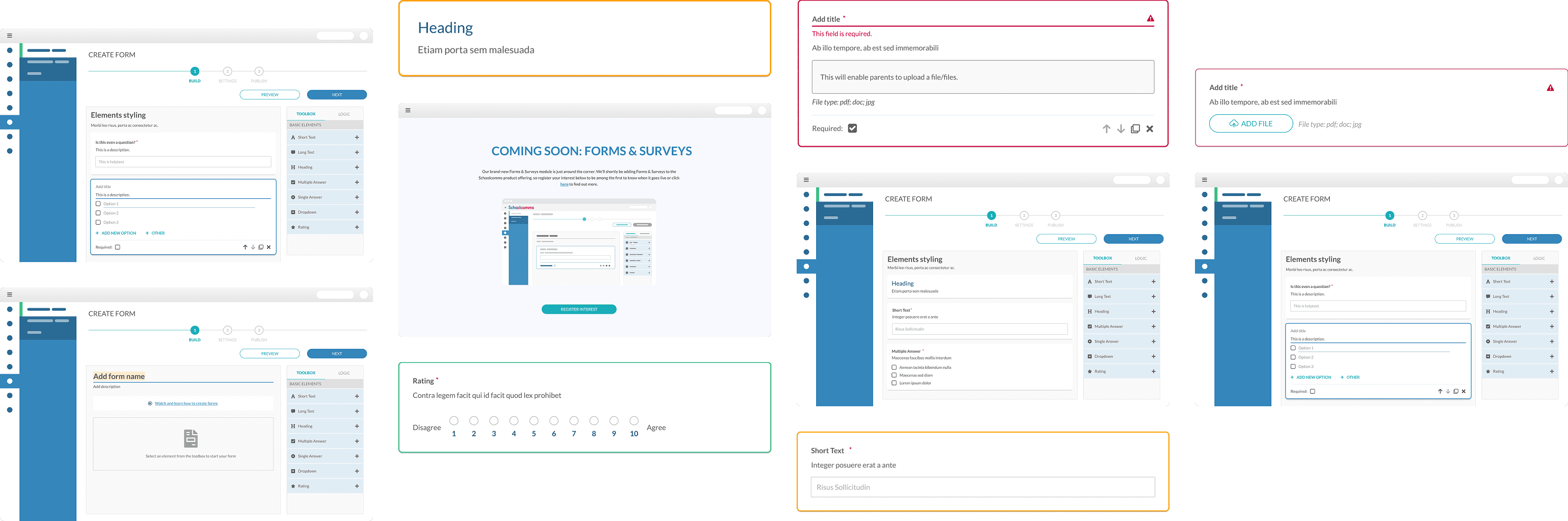
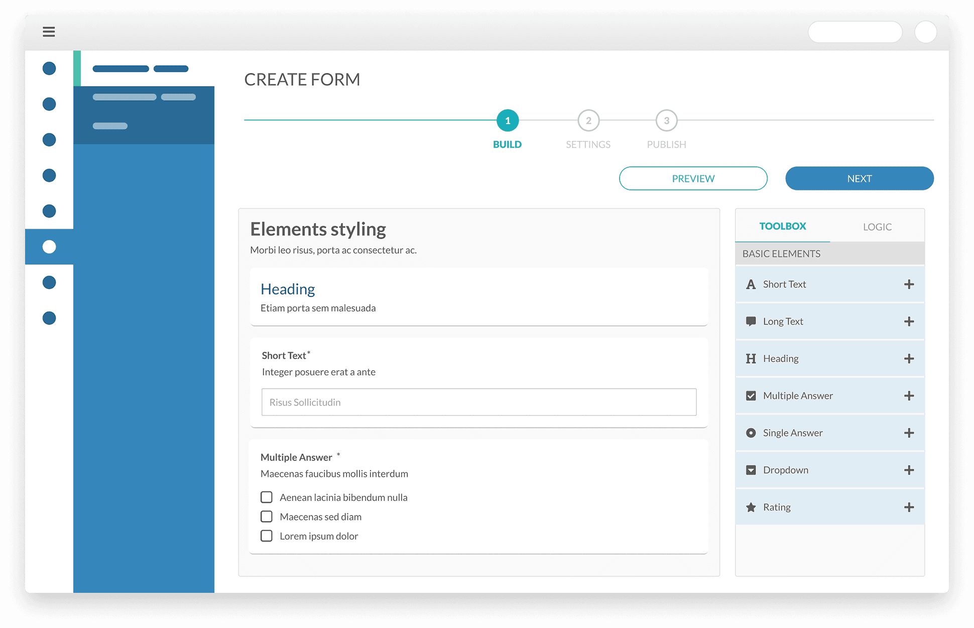
Mapping user journeys: Wireframes
Next, I facilitated collaborative workshops with the team where we defined quick user-flows using post-its and a list of functionality/requirements. With those flows in place I created low-fidelity wireframes to further define layout, structure, and interactions.
These wireframes served as a bridge, allowing stakeholders to visualise workflows and developers to anticipate technical constraints. However, in hindsight, this step could have been streamlined, and I could've started the high fidelity immediately. This would have saved time without sacrificing clarity.
Below:
From design to publish: One of the user flows created as part of this project

Final design
The final design focused on building something simple, scalable, and easy for both staff and parents to use. I prioritised clarity, structure, and flexibility, while staying aligned with business and technical constraints.

Follow the established Figma Library
I used our existing Figma Library to ensure design consistency, speed up development, and reduce friction for users already familiar with the platform.
User-centric design
Every decision was backed by research, addressing genuine user needs and removing unnecessary complexity.
Keep It Simple “S'il vous plaît” & scalable
I focused on designing a structure that was intuitive for non-technical users while flexible enough to scale with future product needs and business goals.
Design approach
My design approach was guided by two key principles: modular foundation and enhanced user engagement, ensuring a scalable and intuitive experience.
Modular foundation
The system was designed with flexibility in mind, leveraging a component-based structure to maintain consistency across screens. This approach streamlined development while allowing for future scalability.
Designing for user engagement
The interface was structured to promote ease of use and intuitive interactions, aiming to reduce friction and encourage engagement. By focusing on clarity and accessibility, we intended to create a seamless experience that would support user adoption.
Side note: Advocating for a strong Design system
I strongly believe that a well-structured design system is essential for creating scalable, user-friendly products. As a designer, I don’t see it as a limitation but as an empowering framework—one that removes unnecessary decision-making, allowing me to focus on usability, functionality, and problem-solving rather than pixel-perfect alignment.
In this project, I followed Atomic Design principles, structuring components from atoms to organisms, ensuring reusability and consistency across the platform. I advocate for designers and developers to build, contribute to, and trust their design system, as it strengthens collaboration between both teams, speeds up workflows, and ultimately results in a more intuitive user experience.
Component design: Keeping it scalable with Atomic design
To maintain consistency and efficiency, I structured components following Atomic Design principles, breaking them down into:
Atoms
The smallest UI elements, such as buttons, input fields, and icons.
Atoms
icons
input field
Option 1
trigger
options
Option 1
action
Add new option
Above:
Example of an atomic component used in the design system.
Molecules
Combinations of atoms that form functional groups, like a search bar or a dropdown menu.
Molecules
edit-mode / default
Option 1
edit-mode / selected
Option 1
edit-mode / filled
Option 1
edit-mode / hover
Option 1
edit-mode / validation
Option 1
This field is required.
view-mode / default
Select an option
view-mode / validation
Select an option
preview-mode / closed
Select an option
preview-mode / open
Select an option
Option 1
Option 1
Option 1
Above:
Example of a molecule combining multiple atomic components.
Organisms
Larger, reusable sections composed of molecules and atoms, such as form builders and dashboard panels.
Organism
Add title
This is a description
Select an option
Option 1
Option 1
Option 1
Add new option
Required
Above:
Example of an organism composed of molecules and atoms.
By structuring the design this way, I ensured scalability and reusability, allowing the system to evolve without unnecessary redesigns. This approach also improved the handoff process—streamlining development while enhancing usability for end users. With a clear structure in place, developers could work more efficiently, and visual consistency was maintained across the platform.
Below:
Example of reusable components used in the design system for this project.

High-fidelity prototyping
Form builder: creating & managing surveys
Following insights from the user-flows and low-fidelity workshops, I translated user flows and low-fidelity wireframes into high-fidelity prototypes, integrating all essential components into our existing Figma Library. This interactive form builder empowers schools to create, customise, and manage surveys efficiently.
What is it?
A streamlined form creation tool designed to simplify survey-building. Schools can explore various question types, structure forms with ease, and reorder elements for flexibility.
MoSCow priorities


Validation
In a ‘Three Amigos’ session, we collaborated across disciplines to refine the validation approach, balancing usability and technical feasibility. After testing real-time validation and full-page validation, we implemented automatic validation triggered upon exiting edit mode, ensuring users receive immediate feedback while reducing form errors.
Below:
Built-in validation system that highlights input errors in real time, guiding users to correct mistakes effortlessly.

Logic menu: simplifying conditional logic
Our research showed that configuring logic for survey questions was a major pain point. To address this, we developed a logic menu, enabling schools to create rules that dynamically adjust form flow based on responses.
What is it?
A visual rule-builder that allows schools to guide respondents through customised survey paths with conditional branching.
MoSCow priorities

To maintain a clear view of the form’s structure while configuring logic, the question toolbox and logic menu were integrated into a fixed side panel. This ensured users could always see the form layout and logic side by side, whether they were adding questions or defining conditions, reducing confusion and improving efficiency.

To visually distinguish primary and dependent questions, I used a two-colour system: green for primary and orange for secondary. This improved scanability and user comprehension. This visual distinction improves comprehension and streamlines user interaction with the conditional logic system, making it easier to follow question dependencies.
Primary question
#44BC87
Secondary question
#FCA311

Settings & publish: controlling form visibility
Schools needed flexibility in deciding who could access forms and whether they were public or private. To address this, we designed a publishing system that let schools control availability, permissions, and messaging.
What is it?
A flexible publishing system that allows schools to manage form recipients, define visibility settings, and streamline communication.
MoSCow priorities


Drafts: saving work without interruptions
To prevent data loss and support a seamless workflow, automatic drafts save progress in the background, allowing users to pause and resume anytime.
What is it?
An auto-save system that ensures drafts are securely stored, letting users edit, manage, and restore past versions when needed.
MoSCow priorities


School Gateway
To support seamless communication between schools and parents, we developed a parent-facing interface as part of the School Forms. While our primary focus was on school staff, this integration ensured a complete experience, allowing parents to easily access, complete, and submit forms.
Fast & easy
Designed with busy parents in mind, this central hub provides quick and intuitive access to all school-related forms.
Simplicity is key
A streamlined list view highlights essential information at a glance, including submission deadlines and form availability.
Forms history
A secure archive of submitted forms allows parents to review past submissions, ensuring accuracy and easy record-keeping.
This interface prioritises efficiency and clarity, ensuring a seamless experience for parents while staying aligned with the wider design system.
Design refinements: evolving the user experience
Throughout the design process, I refined key areas based on internal feedback and iterative testing to create a more intuitive experience within project constraints.
Improved information hierarchy – I adjusted layouts to prioritise key actions and reduce cognitive load. Labels and field groupings were refined to improve scanability and help users complete tasks faster.
Enhanced form interactions – Input behaviours were fine-tuned to clarify required vs. optional fields, improve validation messaging, and reduce friction when navigating forms.
These refinements were essential in delivering a smoother, more usable experience while staying aligned with technical and business requirements.
Delivery
Project status
While the project reached final design and entered development, a strategic shift led to Forms being deprioritised in favour of other initiatives. This decision was made at an organisational level and was not related to the progress or quality of the work.
The work remains a strong reference point should the initiative be revisited.
Final touches: preparing for development
Review with stakeholders & finalise designs
I presented the latest high-fidelity designs for feedback and sign-off. Stakeholder input and internal testing insights guided refinements before the final development handoff.
Handoff to development
Once the designs were approved, I prepared detailed documentation and assets to support a smooth handoff, making sure the development team had everything they needed.
After the snap: the road not taken
(planned next steps had the project continued)
Quality assurance
Ensuring the implementation matched design standards through close collaboration with the dev team.
Launch & monitor
Tracking usage, running user interviews, and validating choices through usability insights.
Enhance MPV features
Expanding on core functionality through continuous iteration based on user feedback.
Key takeaways
Refining my process
This project strengthened how I approach complex problem spaces. It reinforced the importance of grounding decisions in user research and competitor benchmarking early on, helping me build clearer, more resilient foundations that stand up even when priorities shift.
Streamlining workflows
Breaking the work into clear, outcome-driven stages became a core part of my process. Combining high-fidelity prototyping with collaborative methods helped align stakeholders early, reduce rework, and keep delivery moving without slowing the team down.
Personal growth
Working through an unfinished project sharpened how I adapt to change. I became more intentional about communication, collaboration, and decision-making, especially when plans evolve, ensuring the team stays focused and confident despite uncertainty.
Online in Glasgow
© 2026 DJoão

