
A web and mobile app that empowers schools to engage parents through surveys aimed at gathering student data, obtaining consents, and collecting feedback to enhance student support.
User research
Problem definition
Hypothesis building
User testing
Competitive analysis
Design methodologies
Low-fi wireframes
Hi-fidelity prototypes
Atomic design
Feedback cycles
Role
Solo UX Designer through end-to-end process: discovery, design, user testing and support through development.
What
Web & Mobile app
Tools
Figma, Mural
Industry
Education
The Problem
Schoolcomms current parental engagement suite is designed to facilitate seamless communication between schools and parents. However, it lacks a dedicated functionality for efficiently capture and manage student data. Several schools have identified this gap and are currently using third-party tools to create surveys and an alternative module within our platform to share them. While this workaround is functional, it introduces significant challenges with data centralisation and the analysis of survey results.

The challenge
How might we integrate a dedicated survey and student data management functionality into the Schoolcomms and Schoolgateway platforms to streamline the process of capturing, centralising, and analysing student data, thereby replacing the need for third-party tools and alternative modules, and improving overall data efficiency and usability?
Research
Steps for initial research
Usage analysis
We observed an increased usage of our links feature, specifically for distributing Google Forms surveys to parents. This presented a missed opportunity for customer retention and engagement, as it would be beneficial to keep all users within the Schoolcomms ecosystem.
Internal research
We analysed support cases and wish-list requests to identify recurring themes and challenges related to student data management, as well as gaps in our communication system.
User surveys
Surveys were conducted to gather quantitative data and feedback on the schools' interest in the newly proposed functionality — an in-house survey builder.
Our findings
No centralised platform for schools to build their own surveys, share with parents and analyse results
Through internal workshops and an analysis of school requests, we confirmed that surveys are a crucial method for parental engagement. Our review of wish-list requests and survey results indicated that schools prefer a centralised form builder, believing that an in-house product would offer greater confidence and security in managing personal student data.
Schools staff is constantly busy and prone to distractions by students and other daily responsibilities
Accommodating staff with diverse responsibilities and varying levels of technology skills was a core challenge in delivering a complete product while maintaining simplicity and practicality. Schools highlighted that a major pain point in their current process was response collection, which they found to be overly manual, time-consuming, and poorly optimised.
Formulating our Hypothesis: Assumptions and Goals
We anticipate that implementing a tailored and school-led survey functionality within would significantly improve the line of communication between parents and schools, creating a more meaningful experience for students.
Taking the time to build an hypothesis, we were able to clearly define our assumptions, guide the design process with focused objectives, and establish criteria for evaluating the impact of our proposed solution. This approach ensured that our development efforts were aligned with real-world needs and provided a structured framework for measuring success and making data-driven adjustments.
Hypothesis
Improved user experience
Centralised data
Increase trust
Improve app usage
Testing methods
Usability Testing
Compare user feedback between the current user journey and the new proposed functionality using prototypes to assess their relative effectiveness.
Responses rate from parents
Analyse the number of responses and interaction received on each form. Gather insights from the schools to compare results from before and after implementing the module.
Track app & Module usage
Monitor app usage and survey completion rates before and after implementation within a realistic timeframe, accounting for external influences like school holidays or events. Analyse the frequency of module use, including the number of surveys created and published on School Gateway, and assess any changes in engagement with other modules using Google Metrics.
User priorities
Based on the insights, we were able to form a list of priorities for the common user. This helped us create our information architecture. Since simplicity was the main focus, we decided to start from a very basic level of functionality with the intent to build upon in the future.
Competitor analysis
To determine the best third-party survey platform for our user’s needs, we shortlisted two options: SurveyJS and Google Forms. We developed a comparison chart to grasp each platform's strengths and weaknesses. Secondly, we also conducted internal user testing, simulating a real-world school scenario to evaluate their performance.


Features analysis
Ease of use
Customisable questions
Variety of questions types
Ability to clone surveys
Conditional logic
Response validation
Required questions
Results can be easily exported by schools - still a manual process
Accessibility and responsiveness
Pain points for SC users
Conditional logic is too complex for the average user
Limited validation options
Data analysis - manual process
Permissions management
Steep learning curve
Lack of design flexibility
Internal testing
To enhance our competitor analysis and gather additional feedback on app usage, I conducted a quick internal user testing session. I created a Mural board featuring two real-world school scenarios and asked members of the Support and Sales teams to develop questions based on these scenarios using GoogleForms and SurveyJS. The Mural board also included a section for users to provide feedback on their experience with each tool. This exercise provided valuable insights into the users challenges when utilising these third-party platforms.

Define
After finalising the list of desired features and requirements based on user needs and team feedback, we proactively selected an Agile framework, mindful of the project's potential duration. Utilising the MoSCoW method, this approach allowed us to prioritise the rapid delivery of a Minimum Viable Product (MVP) to users, establishing a strong foundation for future enhancements. I conducted several workshops to help the team better define the final goal and visualise the final product.
Users insights
During the research phase of the project, I clearly defined recurring patterns and requests.
User-friendly and uncomplicated interface
Allow customisation
Flexible visibility when publishing
Be able to easily share with parents and analyse responses
Account for a busy school and possible distractions
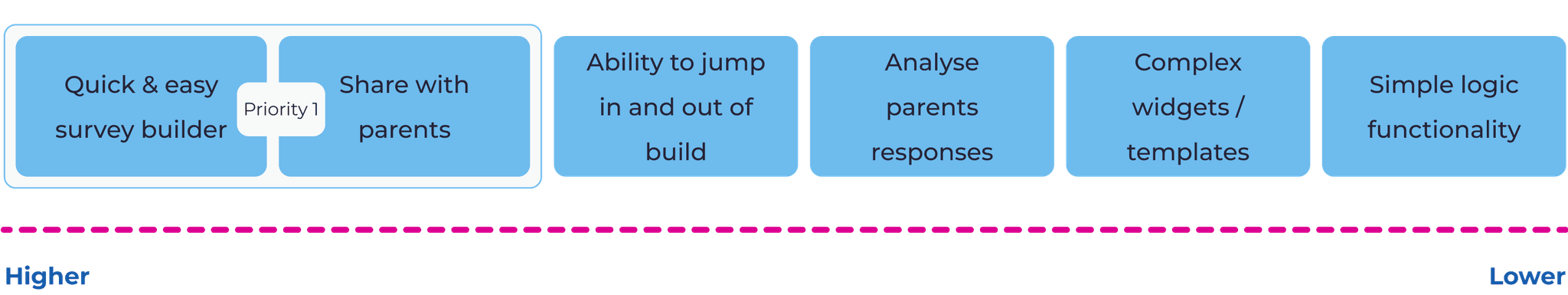
MoSCoW method
Must have

Could have

Should have

Won't have

Minimum viable product (MVP)
Informed by user needs prioritised during the MoSCoW method workshop, we defined the MVP for this project. Our focus was on 'Must Have' and 'Should Have' features to ensure maximum impact.
Basic elements for fast forms building
Enabling schools to tailor forms to their needs
Schools control publishing timelines and access permissions
Spreadsheet download for initial results analysis
Autosave saves the form as a draft helping in case of external distractions
See - Do
At this stage, I facilitated collaborative workshops with development and product teams to define the user interface and interaction flow for the new feature. Employing the See-Do methodology, a streamlined approach based on the Object-Oriented UX (OOUX) framework, we maximised user-centricity while ensuring efficient collaboration. This lean framework eliminates visual distractions inherent to wireframes, presenting information as a clear, written list of screens and functionalities accessible to both design and technical team members.
Questions to answer on the sessions:
Visual cues
What information will the user see on each screen?
Interaction points
What actions will the user be able / have to perform?
Early team involvement resulted in invaluable recommendations and feedback, shaping the foundation for a user-centric and technically sound experience. This collaborative approach ensured alignment across disciplines, resulting in a refined solution that surpasses mere user-friendliness and extends to technical feasibility.
See-Do workshop
Initial stages of the workshop sessions

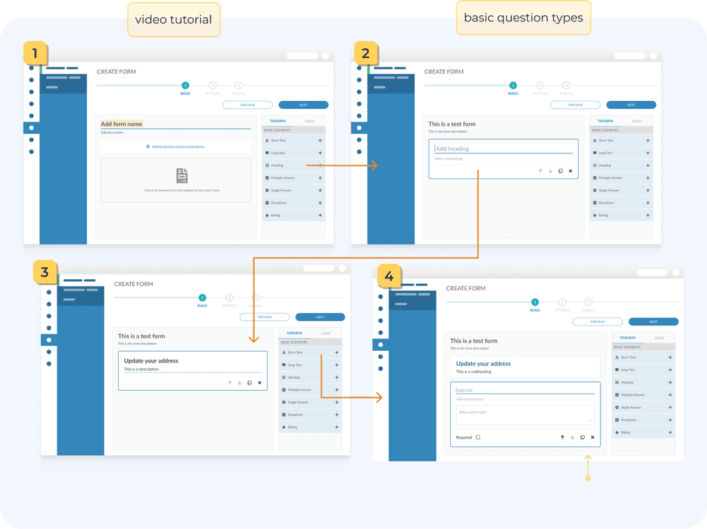
User Flow
To ensure intuitive user journeys, I began by mapping out user flows across various scenarios. This served as the initial step in identifying possible pain-points and optimisation of the product interactions.
Build a form - user flow
One of the user flows created as part of this project

Wireframes
Following the See-Do workshops, I began the visual design process by creating low-fidelity wireframes. This rapid prototyping technique, combined with utilising the existing Figma Library and adding only the necessary components, enabled swift and efficient communication with both the development team and stakeholders. The wireframes provided a clearer vision of the interface’s intended layout and functionality.
Wireframes - From Design to Publish
One of the user flows created as part of this project

Final Design
The core design goal for this project was to develop a user-friendly, engaging, and efficient module that seamlessly integrates with both Schoolcomms and School Gateway. To achieve these objectives, I adhered to four design principles:

Follow the established Figma Library
To keep the user interface familiar and easy to use on both platforms, I followed the existing Figma Library, adding new components when necessary. This approach not only fosters user trust and ensures an intuitive experience but also accelerates the development process.
Designs are user-centric
All designs are created with a user-centric approach, ensuring that user needs are consistently prioritised and addressed. Each design decision is carefully justified and supported by user research and feedback, guaranteeing that the final product aligns with user expectations and requirements.
Keep It Simple “S'il vous plaît”
With a focus on clear visuals and inclusive, intuitive interactions, I aimed to create an engaging user experience while adapting the module’s complexity to accommodate users with varying technical abilities and accessibility needs.
Business strategy
As a business, our focus is on efficiency, growth, and customer retention. While prioritising user needs, we aimed to build a flexible product that seamlessly integrates with our existing offerings and is scalable for future growth.
Design approach
Modular foundation
I followed the Atomic Design process, focusing on reusability across different components. This approach ensures consistency and reduces development time.
Enhanced user engagement
To enhance user experience, I went beyond established design rules by integrating accessible status indicators, semantic colours, iconography, and a clear font size hierarchy. My goal was to create interactive components that modernise the interface and improve overall usability.
Atomic Design
Implementing this modular approach proved to be an engaging and methodical exercise. The collaborative process ensured comprehensive input from all teams, leading to an intuitive user experience, minimised errors, and facilitated faster development.
Atoms
Atoms
icons
input field
Option 1
trigger
options
Option 1
action
Add new option
Molecules
Molecules
edit-mode / default
Option 1
edit-mode / selected
Option 1
edit-mode / filled
Option 1
edit-mode / hover
Option 1
edit-mode / validation
Option 1
This field is required.
view-mode / default
Select an option
view-mode / validation
Select an option
preview-mode / closed
Select an option
preview-mode / open
Select an option
Option 1
Option 1
Option 1
Organisms / Components
Add title
This is a description
Select an option
Option 1
Option 1
Option 1
Add new option
Required
Components
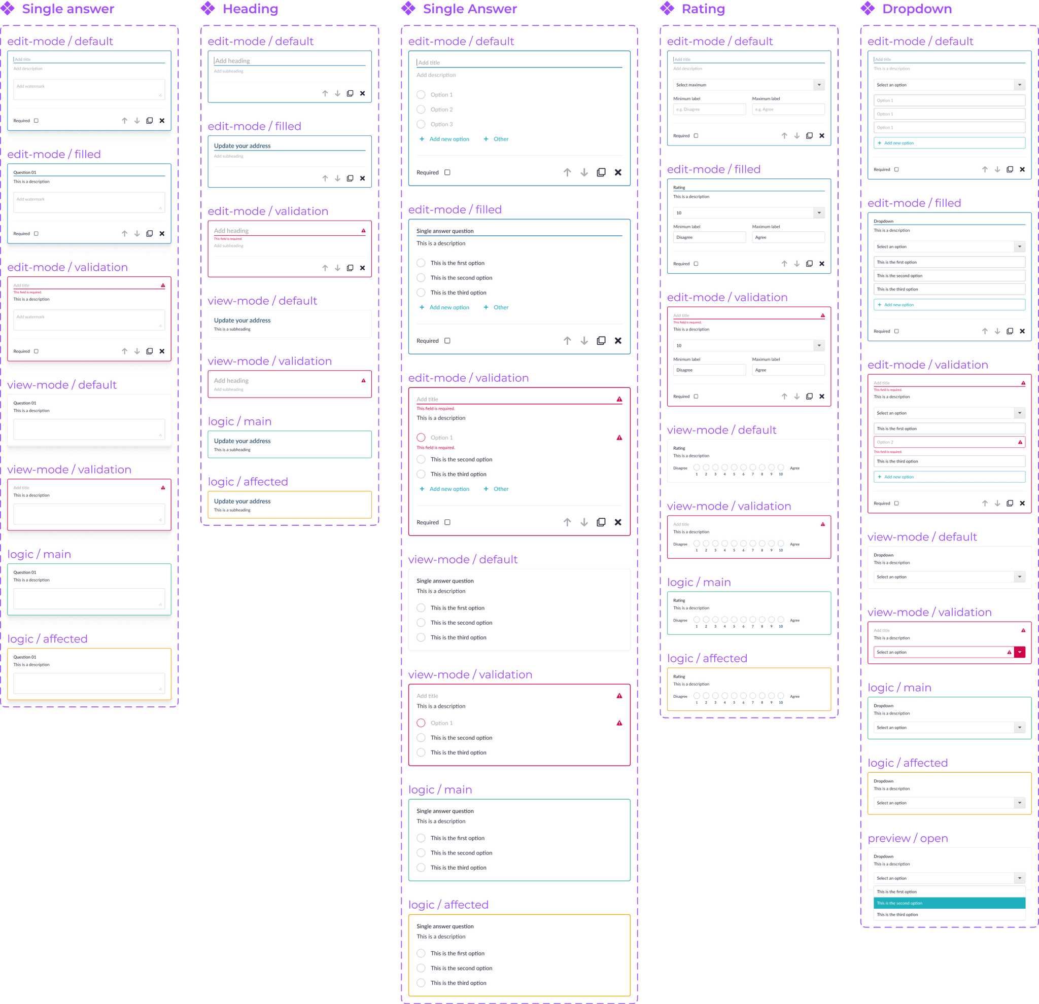
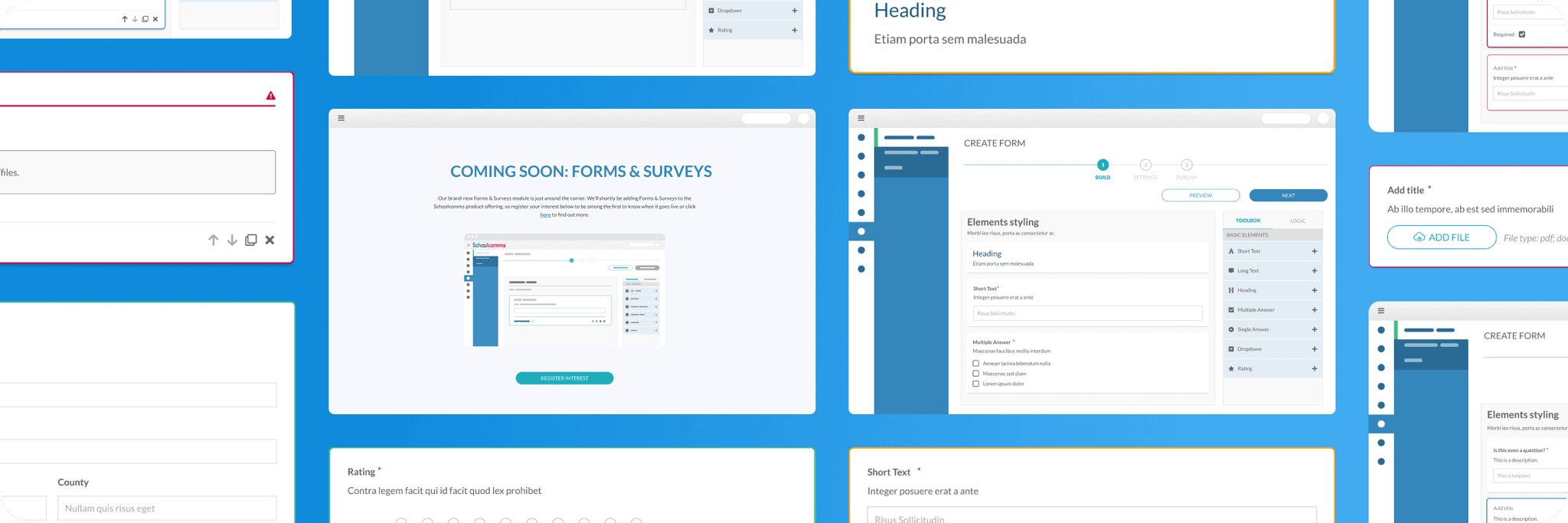
High-fidelity prototyping
Forms designer
Following the insights gathered during the See-Do workshop, and with all essential new components integrated into our existing Figma Library, I begun converting the user flows and low-fidelity wireframes into high-fidelity prototypes.
What is it?
One-stop shop interactive editor, enabling schools to create and explore various question types to better understand which one suits best their needs.
MoSCow priorities


Validation
During a “Three Amigos” session (developer, designer, and product owner), we evaluated two validation approaches: real-time validation as the user builds the question and full-page validation upon clicking the "next" button on the navigation widget. Ultimately, we opted for automatic validation triggered upon exiting edit mode, where the user clicks away from the individual question. This approach reduces errors by offering immediate feedback and targeted assistance, highlighting specific issues within each question for a more advanced user experience.

Logic menu
During the discovery phase, it became evident that the primary challenge for users would be configuring logic behaviour for each question. Therefore, it was essential to ensure a simple and intuitive user experience when implementing conditional logic.
What is it?
This section enables schools to add rules that control the survey flow based on parents' answers. It supports conditional branching, showing or hiding questions, and guiding respondents through customised paths for a more relevant survey experience.
MoSCow priorities

To maintain a clear view of the form's structure while adding conditional logic, the question toolbox and logic menu were integrated into a fixed side panel. This design ensures that users can always see the form's layout and logic, whether they are building the form or defining conditions.

Additionally, a two-colour scheme was implemented: green (#44BC87) for primary questions and orange (#FCA311) for secondary questions influenced by the primary ones. This visual distinction enhances comprehension and simplifies user interaction with the conditional logic system.
Primary question
#44BC87
Secondary question
#FCA311

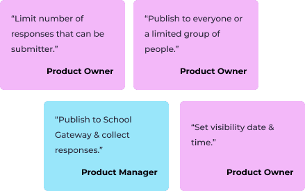
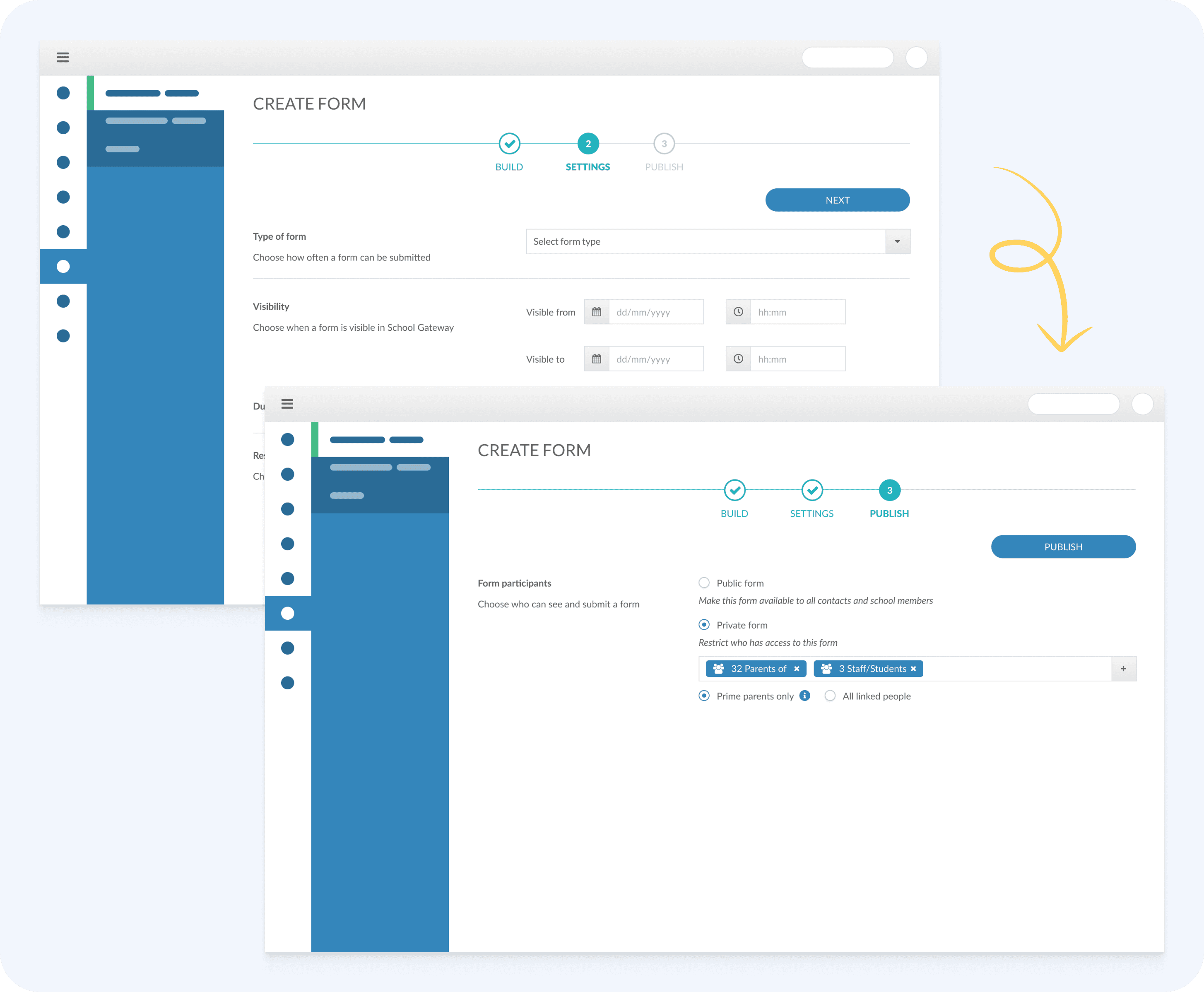
Settings + Publish
In response to user feedback highlighting the need for greater control over form recipients, I designed a flexible system that allows schools to determine when forms are available on School Gateway and whether they are public (visible to the entire school) or private (targeting specific groups). This user-centred solution not only enhances control by letting schools build forms without automatically making them available, but also streamlines communication by addressing previous challenges with message targeting. By integrating the Messaging module with the new Forms module, we’ve created a seamless experience that enables schools to contact parents directly within the platform and manage follow-up communication more efficiently.
What is it?
A flexible system that allows schools to decide precisely when and to whom a newly created form should be published, whether to the entire school or specific groups.
MoSCow priorities

Drafts
For the MVP phase, we streamlined the draft functionality to address user needs while focusing on the project's more challenging aspects. Forms automatically save in the background every few minutes, protecting against accidental data loss due to the system's security timeout. Users can easily access and manage these drafts through a dedicated menu, allowing them to continue editing or delete them as needed. Future iterations beyond the MVP will enhance this functionality by enabling users to save their progress at any point and easily pick up exactly where they left off, ensuring a seamless editing experience.
MoSCow priorities


School Gateway
Prioritising the development of the initial Minimal Viable Product (MVP), we focused on providing schools with a valuable tool to address a critical gap in our product suite. Recognising the importance of promoting parental engagement and supporting their role in their children's academic lives, we aimed to holistically meet the needs of both schools and parents. To achieve this, we conducted a targeted survey of parents to gain insights into their specific requirements for the School Forms module.
Fast & easy
Understanding that parents juggle busy schedules, we designed a streamlined central hub for all school forms, ensuring quick and easy access.
Simplicity is key
Simple list that allows parents to quickly understand crucial information about each form at a glance, including submission deadlines and whether it has limited availability.
Forms history
Maintain a secure history of submitted forms, allowing parents to easily check past submissions and make sure the information is still accurate.
Following the same design principles used for the school's Forms interface, I developed a straightforward interface for parents to easily access both available and previously submitted forms. This user-centric approach ensures that parents can complete, review, and submit forms efficiently. By aligning with the established design principles, the interface provides a seamless experience that complements the overall system, supporting smooth interactions for parents.
Deliver

Spoiler alert!
The module development was cancelled

While the project reached the final design stage and development was underway, we weren’t able to reach full development due to a strategic shift. Even though it’s potential is recognised, the leadership team reallocated all company resources to prioritise other pressing initiatives, with the intention to revisit Forms for future development.
Green pastures:
Review with Stakeholders & finalise designs
Present the updated designs and prototypes to stakeholders for review and approval. Gather feedback and incorporate any necessary changes to finalise the designs.
User testing
We conducted several internal usability sessions using high-fidelity prototypes to gather initial feedback. Our goal was to implement a phased release, allowing us to iterate and refine the product based on ongoing customer feedback.
Handoff to development
Prepare design specifications and assets for handoff to the development team. Provide clear documentation and support to ensure smooth implementation.
After the Snap:
Quality Assurance
Work closely with the development team during the implementation phase to ensure that the designs are implemented correctly and meet the desired quality standards.
Launch and Monitor
After product launch, conduct user interviews to make sure all requirement were answered.
Follow the steps to validate the hypothesis defined on the research phase.
Enhance MVP feautures
Continuously iterate and improve the product based on user feedback and data analysis.
Key takeaways
Learning opportunity
Although the project itself wasn't finalised, this experience was instrumental in refining my design process. I identified areas where research could be strengthened, leading me to delve deeper into user needs and competitor analysis. This newfound focus has resulted in a much clearer understanding of the target audience and their pain points. While the final product may not have been fully built, the insights gained will inform future projects, ensuring a user-centric approach from the very beginning.
Project management
I realised that breaking the design process into manageable stages is essential for clearly defining each phase’s goals and removing unnecessary steps early on. In future projects, I plan to replace low-fidelity wireframes with collaborative workshops, such as See-Do, and develop high-fidelity prototypes using our established Figma Library and Design System. By focusing on activities that directly advance the project and keeping the team engaged, I aim to optimise efficiency and streamline the design process.
Personal growth
This project proved to be a valuable lesson in resilience and adaptability. By experiencing an un-developed project, I've learned to separate project outcomes from personal failures. This experience gave me a stronger ability to adjust and move forward. Ultimately, I've come to embrace the design journey itself, valuing the learning and growth that occurs throughout the process, regardless of the final result.

