
Hitting start: A UI-focused exploration of clarity, hierarchy, and system consistency
CeX has a strong personality, but its outdated interface often gets in the way.
Cluttered menus, clunky navigation, and frequent dead ends make browsing and comparing items harder than it needs to be, something I’ve experienced first-hand as a long-time customer.
This UI exploration keeps CeX’s identity intact while introducing more clarity, structure, and visual polish. Focusing on layout, consistency, and accessibility, the goal was to make the shopping experience feel smoother, more intentional, and easier to navigate.
Role
UX/UI Designer
Platforms
Web
Design tools
Figma


Visual audit
Before diving into redesign, I ran a quick visual and structural audit to identify where the existing interface was falling short. I wasn’t aiming for a deep UX teardown, just a focused review of key screens to spot visual inconsistencies, weak hierarchy, and layout issues.
Homepage overview
The page lacks a clear visual hierarchy, with too many elements competing for attention. Every element - banners, product cards, carousels, buttons - competes for attention, resulting in a noisy and overwhelming interface. Without a clear hierarchy or scannable layout, users struggle to understand what to do next or what’s most relevant to them. A more structured layout, stronger typographic scaling, and deliberate visual pacing would help guide focus and improve overall usability.
CeX's navigation needs a refresh. The current menus are confusing and lack intuitiveness, making it difficult for users to find what they're looking for.
Liam, 18
First-time seller
CeX's navigation needs a refresh. The current menus are confusing and lack intuitiveness, making it difficult for users to find what they're looking for.
Paula, 23
Sustainability-focused buyer

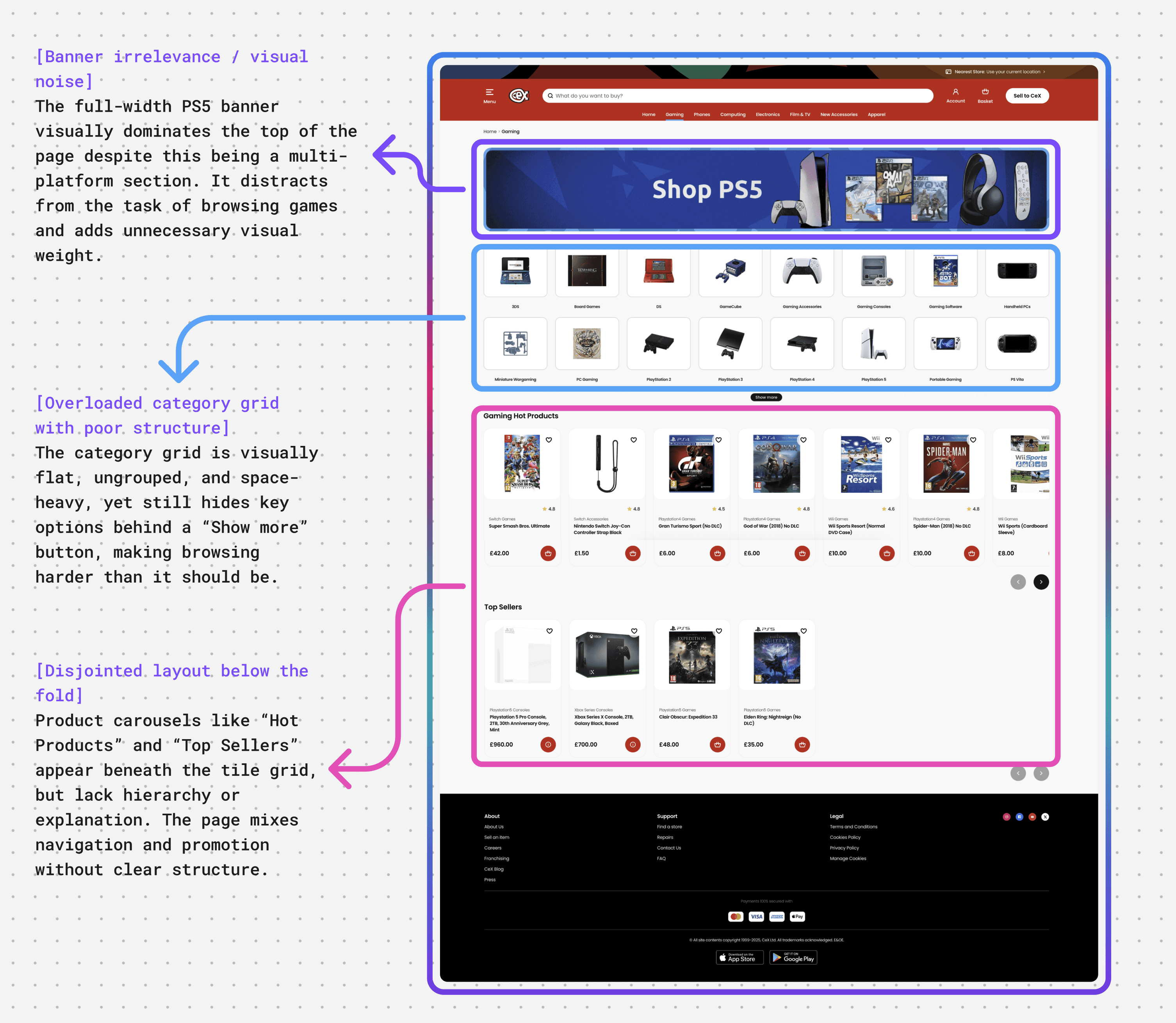
Browse products
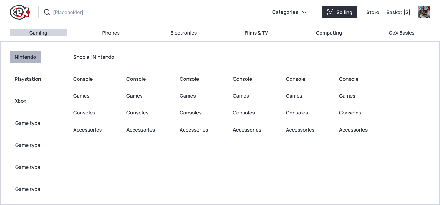
The browse page lacks structure and scanability. A dominant banner, flat grid of categories, and stacked product carousels all compete for attention without clear visual hierarchy. Important content is hidden behind "Show more" buttons, and users can't filter games by genre or popularity without selecting a platform first, creating friction and making it harder to explore freely.
CeX's navigation needs a refresh. The current menus are confusing and lack intuitiveness, making it difficult for users to find what they're looking for.
Neil, 50
The deal-hunting collector
CeX's navigation needs a refresh. The current menus are confusing and lack intuitiveness, making it difficult for users to find what they're looking for.
Gabby, 30
The Bargain-Seeking Gamer
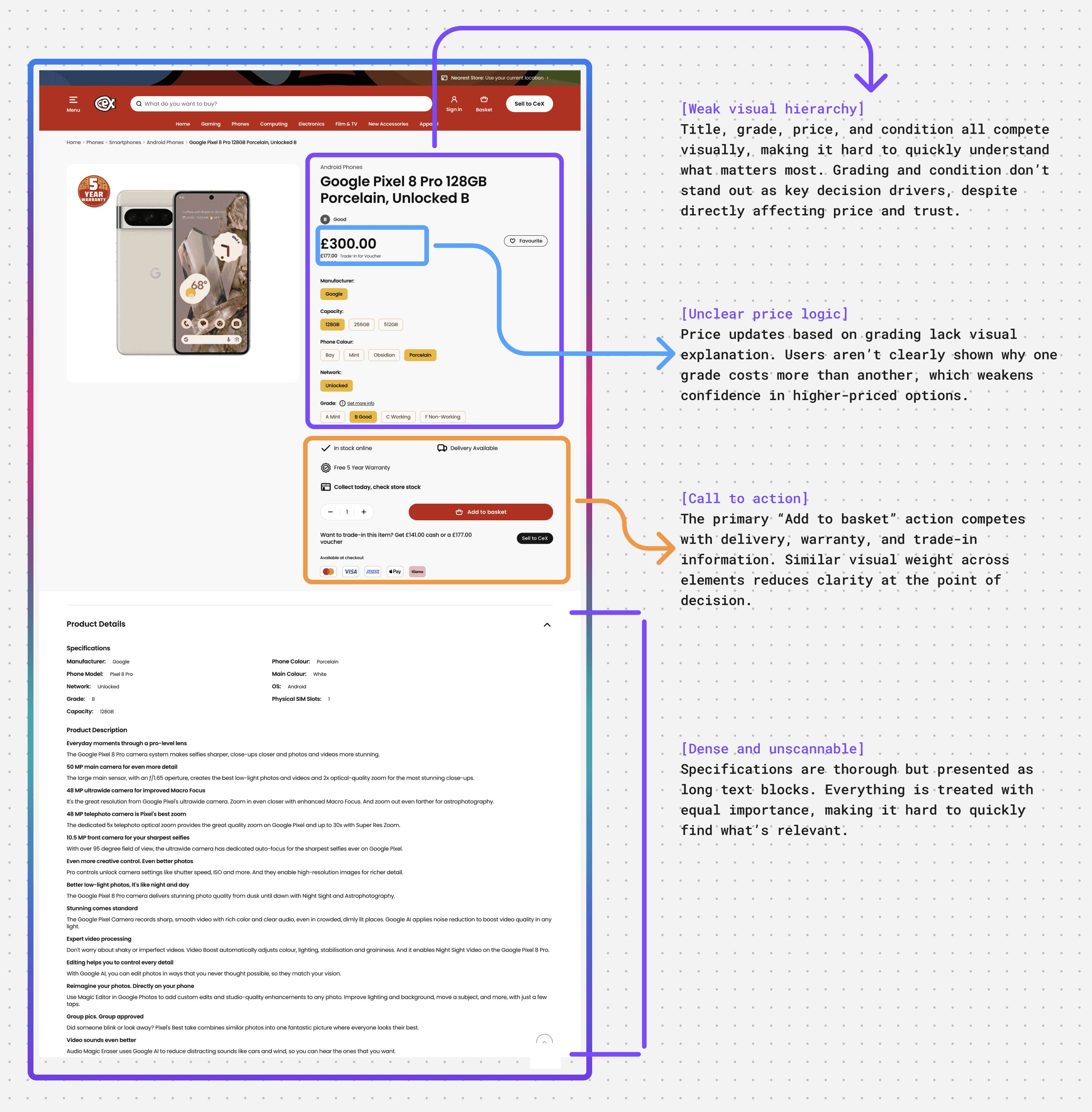
Product details page
This page carries the highest decision load in the CeX experience. It combines product information, condition grading, pricing, trust signals, and actions in a single view. While all the necessary information is present, the lack of clear hierarchy and grouping makes it harder than necessary for users to confidently understand what they’re buying and move forward.
I get nervous buying phones because I’m never 100% sure what condition I’m actually getting.
Alex, 31
Repeat buyer
There’s a lot of info, but it takes time to work out what really matters.
Sam, 26
First-time second hand buyer

Same task, different experiences
From a UI and design system perspective, similar purchase decisions are presented through different patterns, increasing cognitive load and reducing predictability across the experience.
This inconsistency informed my approach to the redesign, focusing on a single, flexible product detail pattern that could adapt to grading differences without changing the underlying structure.
Key takeaway
This quick visual audit helped me prioritise which layout and content decisions to challenge in the redesign, especially around spacing, typography, and visual hierarchy. Rather than overhaul every screen, I focused on creating a more focused, scannable experience while maintaining CeX’s recognisable identity.

Early structure exploration
Early wireframes covered the core CeX experience, from discovery through to checkout and selling. I restructured the homepage, browse and product pages, franchise sections, store finder, basket, and sell flow to establish clearer hierarchy and more consistent layout patterns.
Working at low fidelity allowed me to test structural decisions quickly and align key journeys before developing the visual system.


Scroll to see more
Visual identity
I wanted to bring structure and consistency to a site known for its chaotic charm. While exploring cleaner layouts, tighter grids, and clearer behaviours, I was careful to preserve CeX’s bold, playful energy. The result is a UI system that feels more intentional and usable, while remaining unmistakably CeX, full of colour, character, and pop-culture flair.
To support this, I built a scalable Figma library from the ground up, focused on reusable, flexible components. This approach makes it easier to maintain visual consistency across the site, while still allowing room for expressive moments in high-content, fast-changing areas.
Foundation
A clear foundation defines the visual language and allows the design system to scale confidently across different screen types and content volumes, without diluting CeX’s personality.
Colours
A high-contrast, bold palette that honours CeX’s existing identity while improving legibility and accessibility.
Colour is applied with intent. Primary red anchors brand moments and key actions, category colours guide navigation and wayfinding, and neutrals create breathing room for content-heavy screens.

Note on the Red Problem:
Because CeX’s primary brand colour is a vibrant red, using it for error states would lead to visual confusion and brand blindness. I solved this by introducing a dedicated semantic palette where the "Error Red" sits at a much deeper, desaturated frequency than the brand red. By pairing these deeper tones with high-contrast iconography and soft background tints, I ensured that critical system feedback remains distinct from standard brand elements and primary actions.
Below:
Banners & Error messages on form

Typography
Sharp, readable type choices to bring hierarchy and rhythm to content-heavy pages.
Font: Manrope
Extra bold
Aa123
Regular
Aa123
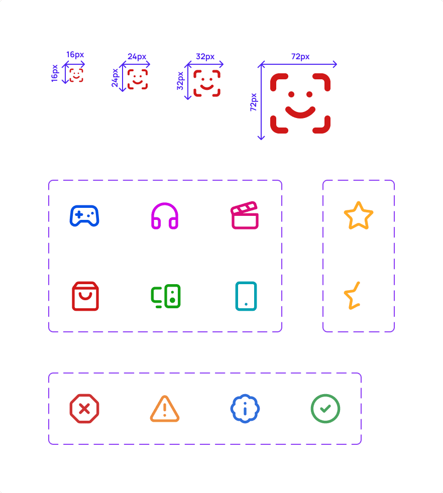
Iconography
Simple, recognisable icons to aid navigation and reinforce meaning without visual noise.
Their use is consistent and purposeful, helping users scan and understand the interface without competing with content. In some areas, icons are also used playfully to add personality and visual rhythm, supporting CeX’s bold, expressive character.
Library: Lucide

Above:
This before-and-after highlights how intentional typography, refined spacing, and purposeful colour can completely transform the interface.
Spacing
The spacing system follows a 4px base grid and adapts across breakpoints, supporting both horizontal and vertical alignment. It helps create clear relationships between elements, keeping layouts readable, balanced, and easy to scan across different screen sizes.
Rather than relying on rigid column grids, layouts use flexible auto-layout rules and responsive spacing. This allows components to adapt fluidly across devices without being constrained by outdated layout structures.

Elevation
Adds depth through shadows and layering, helping prioritise content and guide user focus while maintaining a playful tone.
Elevation 0
e.g. Buttons, banners, text areas, forms
elevation.0
Elevation 1
e.g. Product cards, info panels, list items
elevation.1
Elevation 3
e.g. Open dropdowns, wishlist icon
elevation.3
Elevation 6
e.g. Drawers, toast notifications
elevation.6
Elevation 8
e.g. Modals, dialogs, overlays
elevation.8
Radius
Rounded corners add softness and visual approachability. A consistent radius scale keeps components visually aligned while echoing CeX’s playful energy.
Radius 0
e.g. Table cells, dividers
radius.none
Radius XS
e.g. Containers, panels
radius.xs
Radius SM
e.g. Buttons, forms, dropdowns
radius.sm
Radius MD
e.g. Cards, modals
radius.md
Radius XL
e.g. Tooltips, playful elements
radius.full
Radius Full
e.g. Avatars, playful button, search
radius.full
Bellow:
Spacing, Elevation & Radius representation


UI Kit snapshot
A structured overview of the reusable components built from the visual foundation.
Focused on navigation, interaction patterns, and commerce-specific modules.
Inputs & Actions
Buttons
A hierarchical action system balancing emphasis and restraint.
Primary actions lead, secondary and tertiary variants support, and utility styles enable contextual control, all shaped by consistent spacing and interaction states.
Below:
Buttons

Inputs & drop-downs
Core input components used for search, selection, and data entry.
Each pattern follows consistent focus states, spacing, and elevation to maintain clarity across contexts.


Clickable prototype
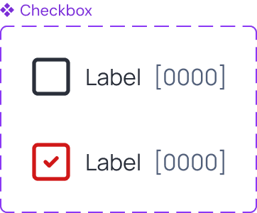
Checkboxes, radio buttons, switches & tags
Selection controls supporting single and multiple, decisions.
Checkboxes enable multi-select, radio buttons enforce single choice, and switches represent immediate on/off states. Tags act as compact visual labels used to categorise products and reinforce content hierarchy across the interface.
Navigation
Global header
The header acts as the primary navigation hub. It combines brand presence, search, category access, and account utilities into a responsive container that adapts across contexts.
Below:
Global header atoms & variations

Below:
Search atoms & components
Type Pik to try 😏
Below:
User menu dropdown & final component

Secondary navigation patterns
Supporting patterns reinforce orientation and hierarchy across browsing and transactional contexts.
Below:
Tabs atoms & animated component

Clickable prototype
Below:
Page navigation breadcrumbs

Below:
Pagination atoms & component
Commerce patterns
Product cards
A scalable commerce component designed to surface essential product information and primary actions within a consistent layout. Each card includes image, category tag, rating, pricing, and contextual actions, adapting to different content types while maintaining visual hierarchy and clarity.
Below:
Product cards details and behaviour

Clickable prototype

Levelling up: The high-fidelity reveal
If you’ve ever shopped at CeX, you know the vibe: it’s busy, bold, and unapologetically energetic. I like that about the brand. But when that energy translates to an overwhelming digital storefront, it can easily turn into a wall of visual noise where everything competes for attention.
My core principle for this redesign was simple: don't lose the soul, but make it 2025 friendly. The goal wasn't to strip away the personality to create just another sterile, minimalist e-commerce site. Instead, I wanted to retain that iconic visual language while completely overhauling the structural hierarchy.
By applying the new foundational grid and a strong typographic hierarchy, alongside purposeful iconography and colour, the interface finally has room to breathe. This section shows how those systematic choices come together, creating an experience that still feels distinctly, proudly CeX, but naturally guides the user exactly where they need to go.


Above:
Before and after of the homepage
Retaining the bold CeX energy didn't mean keeping the clutter. Through standardised product cards, clear categorising tags, and a breathable mega-menu, the 2025 interface proves that high-density inventory doesn't have to mean high cognitive load.
Clarifying the two-way street
CeX is a unique beast: it’s a marketplace where users are both buyers and sellers. Showing purchase prices alongside trade-in values often results in a cluttered product card. To fix this, I simplified the default view to focus purely on buying, but elevated the 'show trade-in values' toggle. When flipped, a high-contrast panel distinctly separates the cash and voucher values. By tying this panel's colour directly to the product category, such as blue for gaming or green for computing, it doubles as a subtle wayfinding system, keeping the interface calm while fully supporting the core business model.
Toggle switch
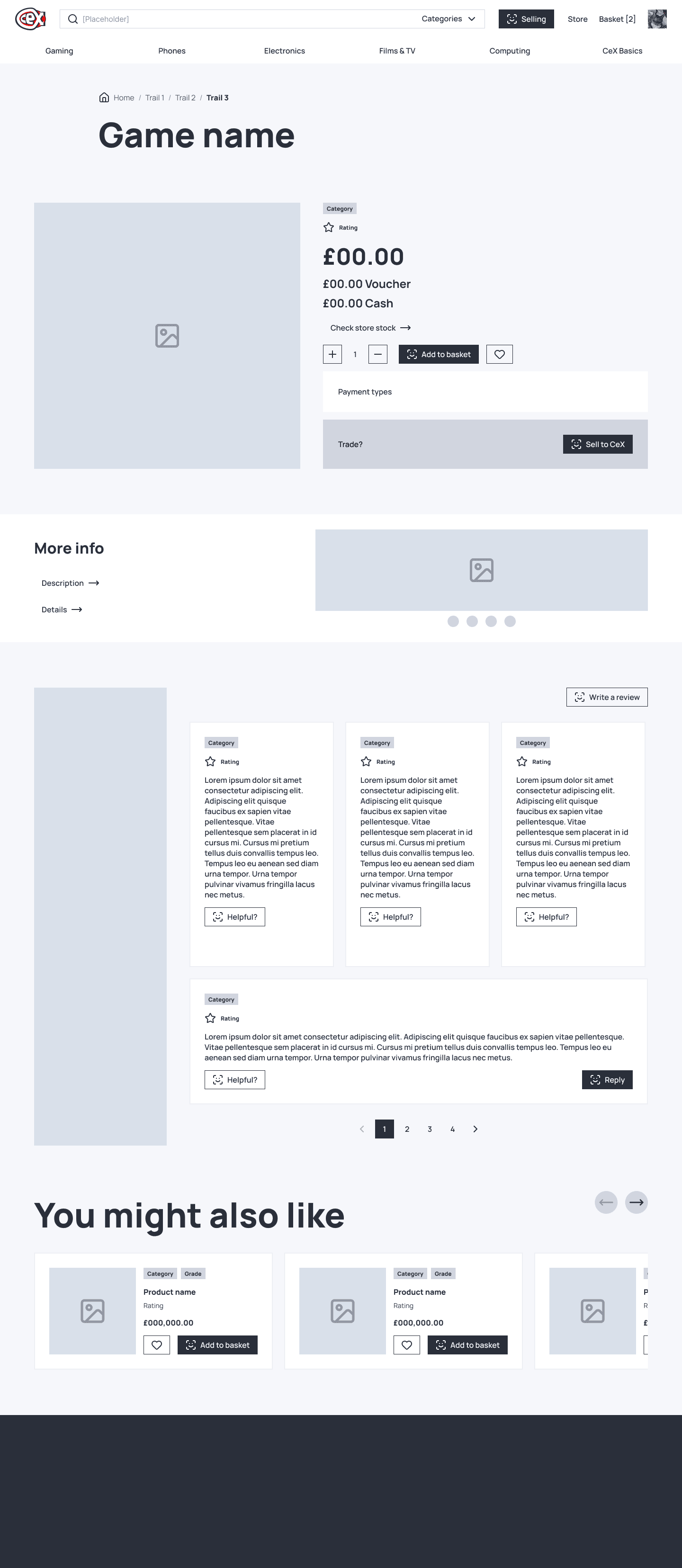
Simplifying the final decision
The product page is where the conversion actually happens, yet the current live site forces users to parse massive, confusing titles that cram in conditions, networks, and technical specs. I stripped all of that away. By designing just two modular templates, one for straightforward items like games and another for graded tech, the product name goes back to being just a title. All the complex variables, such as cosmetic grading and network lock, are now handled through clean interactive selectors. It removes the visual clutter completely, making the final purchase decision feel effortless.

Above:
Game details page
Above:
Tech details page
Scroll to see more
Consistency across the ecosystem
Beyond the core shop, the redesign extends into the broader brand touchpoints. By applying the same rigorous design system to utility pages, such as the store finder and franchising portals, the entire digital presence feels like a single, unified experience. These screens prove that even the most functional, data-heavy pages can remain on-brand and accessible without losing their clarity.


Scroll to see more
Streamlining the purchase
The basket and checkout journeys are where the most complex logic lives, requiring a delicate balance between high data density and user clarity. I focused on stripping away any unnecessary friction, such as the bureaucratic forms and unclear progress indicators that often plague high-inventory retail platforms.
Whether a user is checking out with a single game or a high-value tech bundle, the flow is now broken down into digestible, modular steps. By using a dedicated sidebar for order summaries and a clean, linear progression through delivery and payment, the experience turns what used to be a daunting task into a simple, guided conversation.
Above:
Flow for buying a game
Figma prototype
Mastering the trade-in
Selling tech to CeX is a fundamentally different mental model than buying, often involving complex searches for specific models and conditions. I designed the sell flow as a focused, multi-step journey that removes the guesswork from the trade-in process.
From the initial product search to the final drop-off selection, the interface uses high-contrast interactive components and a progress-driven layout. By isolating each decision, such as selecting the device network or confirming the cosmetic condition, the user is never overwhelmed by data. It turns a complex logistical task into a simple, confidence-building experience that rewards the user for their tech.
Above:
Flow for selling a gaming console
Figma prototype
Scroll to see more
Key takeaways
Respecting the soul of a brand
This project reinforced the idea that modernising an experience does not have to mean stripping away its personality. While it was tempting to move toward a minimalist aesthetic, I found that lean design works best when it embraces the existing energy of a brand. By focusing on hierarchy rather than removal, I was able to make the storefront "2025 friendly" while keeping the chaotic charm that loyal customers expect.
Systems as a foundation for speed
Building a rigorous UI kit early in the process was not just about consistency, it was the primary driver for design efficiency. Once the typographic scales, 4px grid, and colour wayfinding systems were defined, complex pages such as the basket and sell flows almost designed themselves. It proves that a well-architected system allows a designer to focus on solving user problems rather than debating pixel values.
Designing for the two-way marketplace
CeX presents a unique challenge because every user is both a potential buyer and a seller. Tackling this project sharpened my ability to manage high-density data without overwhelming the user or overcrowding the screen. By using a consistent set of components and a clean layout for both journeys, I created a scalable framework that makes the entire "buy and sell" loop feel like one unified, effortless experience.
Online in Glasgow
© 2026 DJoão

